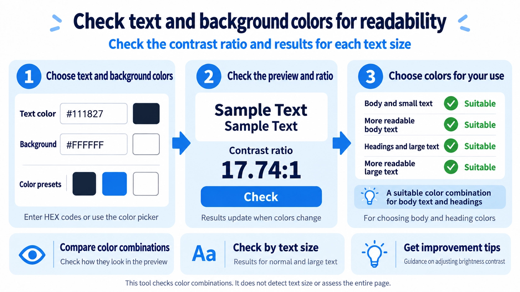
Set the text and background colors, then click “Check” to view the contrast ratio and WCAG AA/AAA results.
What this tool does
Compare a text color with a background color to calculate the contrast ratio and check WCAG AA and AAA thresholds.
How to use it
- Choose the text and background colors with the color pickers or HEX fields.
- Click “Check” to calculate the contrast ratio.
- Review the WCAG AA and AAA results for normal and large text.
- Adjust the colors and check again if needed.
Supported input and notes
Enter text and background colors to check their contrast. The WCAG thresholds differ for normal and large text; review the result for your intended use.
When it is useful
Useful when choosing readable text and background colors for web pages, interfaces, and digital content.
Different Colors Can Still Be Hard to Read
Text and background may look different while still having similar brightness. This tool calculates their contrast ratio instead of relying only on visual impression.
Thresholds Depend on Text Size
The same color pair can be judged differently for normal and large text. This tool does not detect your actual font size; it shows separate results for the normal-text and large-text thresholds.
Normal Text
AA is checked at 4.5:1 or higher, while the stricter AAA level is checked at 7:1 or higher.
Large Text
AA is checked at 3:1 or higher, and AAA at 4.5:1 or higher. Choose the relevant result based on the actual size of the text you plan to use.
AA and AAA Serve Different Goals
AA is a common target for readable text, while AAA applies a stricter contrast target. Failing AAA does not automatically mean a color pair is unusable; text size and context still matter.
Color Is Only One Part
Font size, typeface, line spacing, and background imagery can affect readability even when the contrast ratio is sufficient.
FAQ
Is a higher contrast ratio always better?
It generally helps readability, but the overall design and use case still matter.
Can the same colors pass for large text but not body text?
Yes. Large text uses a lower contrast threshold than normal text.
Can I check transparent text colors?
This tool checks HEX text and background colors. It does not calculate the composited result of transparent colors.